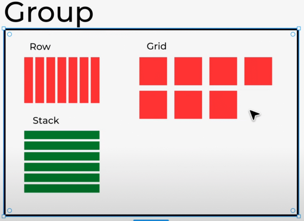
Welcome to Day 1 of my 10-day Gutenberg Challenge! If you’ve already explored the basics of the WordPress Block Editor (Gutenberg) from my earlier tutorials, you’re now ready to level up your skills.
In this beginner-to-advanced series, we’re diving deeper into building fully responsive and visually appealing layouts using only the default Gutenberg blocks—no extra plugins, custom CSS, or code required!
Let’s Cick off Day 1 with the four most essential layout elements in Gutenberg:
1️⃣ Group
2️⃣ Row
3️⃣ Stack
4️⃣ Grid
Understanding these four elements is crucial to creating clean, flexible designs in WordPress.

What is the Gutenberg Group Block?
The Group block acts like a wrapper or container. You can place multiple blocks inside it and apply shared styles like background colors, padding, or spacing. Think of it like a <div> in HTML.
You can group text, icons, headings, images, or any combination of blocks—and then reuse or rearrange them easily. Just select the elements, press Shift, and use the Group option or keyboard shortcut (Cmd + G on Mac / Ctrl + G on Windows).
Understanding the Row Block in Gutenberg
The Row block arranges elements side by side—horizontally—just like columns. It’s perfect for creating layouts like:
✅ Multi-column sections
✅ Icon + Text alignments
✅ Call-to-action bars
Key features of the Row block:
✅ Justify items (left, center, right, space-between)
✅ Orientation (horizontal or vertical)
✅ Wrapping (allow items to wrap in multiple lines)
✅ Responsive flexibility (adjusts based on content size)
By selecting multiple Group blocks and converting them into a Row, you’ll instantly see how powerful and clean horizontal alignment can become in your layout.
Stack Block: Vertical Alignment Made Easy
While the Row block works horizontally, the Stack block is designed for vertical alignment.
It stacks items one below another and lets you:
✅ Adjust vertical spacing between blocks
✅ Align content left, center, right, or stretched
✅ Set block spacing without using margin or padding
This is perfect for mobile-first designs or vertically organized content sections.
The Grid Block – Advanced Layouts, Simplified
The Grid block is where Gutenberg shines for more complex layouts. It allows you to:
✅ Create multi-column designs
✅ Define column spans
✅ Control grid gaps and spacing
✅ Mix and match elements in a structured layout
Whether you’re building pricing tables, portfolios, or custom sections, the Grid block gives you complete visual control.
You can even combine Group + Row + Stack blocks inside a Grid to make advanced responsive designs without touching any code.
Use Keyboard Shortcuts to Speed Up Your Workflow
✅ Duplicate blocks: Cmd + Shift + D (Mac) / Ctrl + Shift + D (Windows)
✅ Group blocks: Cmd + G / Ctrl + G
✅ Select multiple blocks with Shift + Click
Final Thoughts for Day 1
If you’ve been wondering how to start designing with Gutenberg without custom code, mastering these four layout blocks is step one.
By understanding how Group, Row, Stack, and Grid blocks work together, you’re setting a strong foundation for building beautiful, functional WordPress sites.
Stay tuned for Day 2, where we’ll begin building real-world sections using these blocks in action. 🎯
👉 Watch the full tutorial on YouTube here: [video link]
Let me know in the comments—which block do you use the most and why?
All Video: 10 days Gutenberg Challange
✅ Day 1: Mastering Gutenberg Group, Row, Stack & Grid Blocks for WordPress Layout
✅ Day 2: How to Create CTA in Gutenberg while exploring Row, Stack, Group & Cover block.
✅Day 3: How Gutenberg Grid works? Learn the Basic of Gutenberg Grid with Stack, Row, Group
✅ Day 4: How to Create a Custom Header & Menu using Gutenberg FSE Blockhttps://youtu.be/jwx9Aacp3so?si=Yli2iQDotqHASNO-
✅Day 5: Gutenberg Loop Builder Explained – Display Blog Posts | Custom posts with Ease
✅Day 6: Gutenberg Loop builder advance design Guide that you should know before using it!
✅Day 7: Gutenberg Bento Grid layout Learn the Advance Gutenberg grid
✅Day 8: Design a Testimonials section in Gutenberg Block
✅Day 9: Design Pricing Table using Gutenberg no additional plugin require
✅Day 10: Discover the POWER of Gutenberg Gradient Style with Grid Layouts
✅Bonus Day 11: Gutenberg Advance Gradient Border Master class

