If you’ve been following the Gutenberg 10-Day Challenge, you know we’ve already covered grids, stacks, and columns. In Day 10, we’re diving into something that will transform your designs: Gradients in Gutenberg.
By the end of this tutorial, you’ll learn how to combine gradients with grid layouts to create vibrant sections that make your website look modern — all without plugins or page builders.
What You’ll Learn in This Tutorial
✅ How to add gradient backgrounds to Gutenberg Group Blocks
✅ The difference between Group vs. Cover Block for gradients
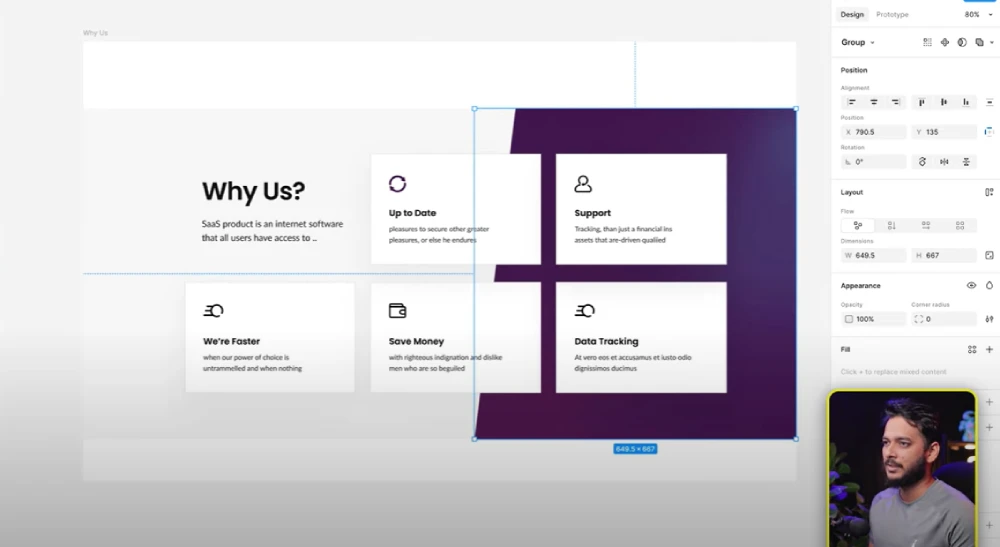
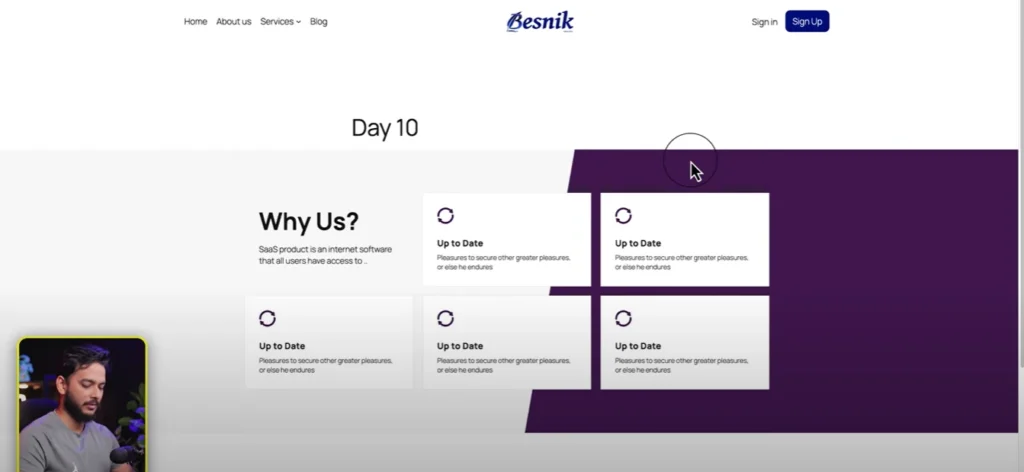
✅ How to combine grid, stack, and SVG icons for a polished layout
✅ How to fine-tune padding, spacing, and angles for professional designs
Setting Up the Gradient Base
✅ Start by creating a new page in WordPress (we’ll call it Day 10 – Gradient Style).
✅ Add a Group Block and set it to Full Width.
✅ From the Styles Tab, apply a gradient background instead of a flat color.
💡 Pro Tip: Use Group Block when you only need a gradient color. If you need an image + gradient overlay, use the Cover Block.

Build the Grid Layout
✅ Insert a Grid Block inside the group.
✅ Adjust minimum column width to create exactly 4 columns.
✅ Add 90px padding (top & bottom) for breathing room.
Add Content & SVG Icons
✅ For each column, wrap elements inside Groups for better styling control.
✅ Add SVG icons (crisp & scalable).
✅ Use headings (H3 or H4) and paragraphs with clear font sizes (18px / 14px).
Style Each Item
✅ Add border colors for subtle framing.
✅ Use stack blocks to manage spacing between text & icons.
✅ Apply 30px padding for each item group to create a neat “card” effect.
Fine-Tune the Gradient
Here’s where the magic happens:
✅ Select your Group Block → go to Background → Gradient.
✅ Add two complementary colors.
✅ Adjust the angle (90°–100°) for the right directional flow.
This creates a modern, professional section perfect for services, features, or portfolios.
Responsive Considerations
✅ Gutenberg’s Grid Block automatically stacks on smaller screens.
✅ Adjust min column width for better control on tablets & mobile.

Final Thoughts
This tutorial shows you how powerful native Gutenberg tools can be. With just Group Blocks, Grids, and Gradients, you can create agency-level designs — no plugins, no extra bloat.
Want to take this further? Future tutorials will cover multi-layer gradients and advanced CSS tweaks for even richer layouts.
Helpful Resources
✅ Learn More About Gutenberg Grid & Stack
✅ Free SVG Icons – Heroicons
✅ Plan Your Layout in Figma
✅ Watch the Full Tutorial Here: (YouTube link)
All Video: 10 days Gutenberg Challange
✅ Day 1: Mastering Gutenberg Group, Row, Stack & Grid Blocks for WordPress Layout
✅ Day 2: How to Create CTA in Gutenberg while exploring Row, Stack, Group & Cover block.
✅Day 3: How Gutenberg Grid works? Learn the Basic of Gutenberg Grid with Stack, Row, Group
✅ Day 4: How to Create a Custom Header & Menu using Gutenberg FSE Blockhttps://youtu.be/jwx9Aacp3so?si=Yli2iQDotqHASNO-
✅Day 5: Gutenberg Loop Builder Explained – Display Blog Posts | Custom posts with Ease
✅Day 6: Gutenberg Loop builder advance design Guide that you should know before using it!
✅Day 7: Gutenberg Bento Grid layout Learn the Advance Gutenberg grid
✅Day 8: Design a Testimonials section in Gutenberg Block
✅Day 9: Design Pricing Table using Gutenberg no additional plugin require
✅Day 10: Discover the POWER of Gutenberg Gradient Style with Grid Layouts
✅Bonus Day 11: Gutenberg Advance Gradient Border Master class

