Are you struggling to understand how to use the Gutenberg Grid in WordPress?
In this tutorial (Day 3 of our Gutenberg Series), we’ll dive deep into how Grid, Stack, Row, and Group blocks work together to create beautifully responsive designs.
Unlike using just the Column block, which can cause issues on mobile, the Gutenberg Grid makes it easier to manage layouts that adapt across devices — and we’ll show you exactly how.
What You’ll Learn in This Tutorial
✅ The difference between using Grid vs. Columns
✅ How to structure sections with Group and Stack blocks
✅ How to apply custom widths and control responsiveness
✅ Tips for spacing, padding, and borders for a polished layout
Setting Up Your Page
1️⃣ Go to your WordPress Dashboard → Pages → Add New
2️⃣ Title it “Day 3 – Gutenberg Grid”
3️⃣ Add a Group block to set the background color (we use Group for solid colors and Cover block for background images).
💡 Pro Tip:
When using Group, disable “Inner blocks use content width” to allow custom widths (e.g., 892px for a perfect layout match).

Adding Title & Paragraph
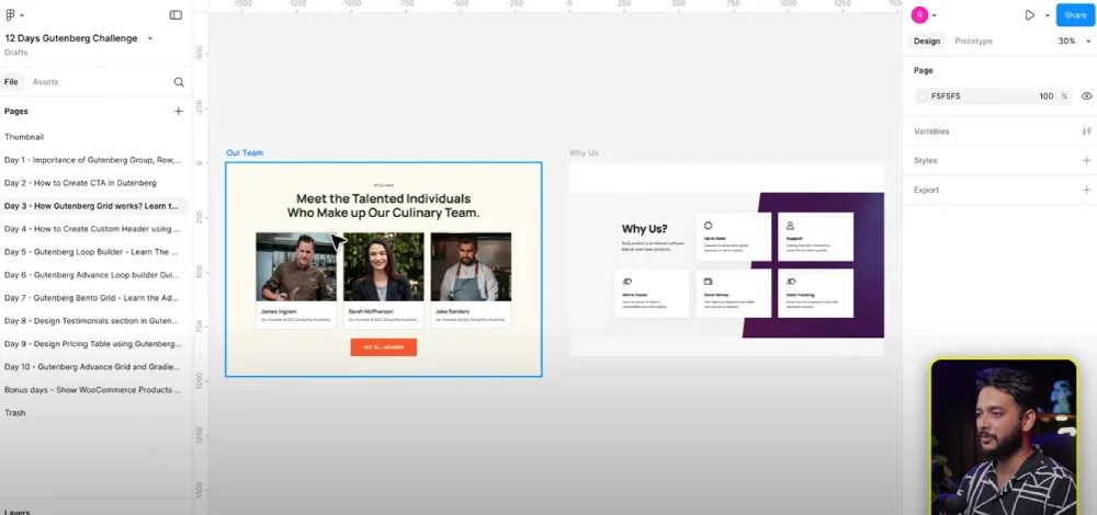
✅ Add a Paragraph block for the section label (“Our Team”).
✅ Add a Heading block (H2 or H3) for the main title.
✅ Adjust font size (e.g., 56px) and weight (Bold or Extra Bold).
👉 Resource: Learn how to add custom fonts & global typography in Gutenberg
Creating the Grid Layout
Here’s where the magic happens:
✅ Insert a Grid block instead of Columns.
✅ Set the Grid to 3 columns.
✅ Adjust spacing for better responsiveness (e.g., 20px for columns).
✅ Why Grid over Columns?
Grids handle responsive breakpoints better and won’t “break” on mobile like Columns sometimes do.
Adding Team Member Cards
Each card contains:
✅ Cover block (for image background)
✅ Heading block (team member name)
✅ Paragraph block (short description)
Design Tips:
✅Use Stack blocks inside each card to keep elements organized.
✅Add padding (30px) and a 1px border for a clean, framed look.
Fine-Tuning Spacing & Responsiveness
✅ Use block spacing instead of margins for better mobile scaling.
✅ Add 60px spacing between the section heading and the grid below.
✅ Test in the responsive preview mode (tablet & mobile).

Advanced Styling
Want to level up? Try:
✅Gradient backgrounds with 2–3 colors for more dynamic sections.
✅Custom typography via Theme.json or plugins like Fonts Plugin.
👉 Advanced gradient tutorial coming soon on the Riad Mahmud YouTube Channel!
Why This Method Works
✅ Cleaner structure → Stack, Group, and Grid blocks keep sections well-organized.
✅ Responsive by default → No messy media queries required.
✅ Reusability → Copy/paste these sections into other pages easily.
Join the Community
👉facebook Join our Facebook Group – Share your designs, ask questions, and get feedback from other WordPress enthusiasts!
Helpful Resources
✅📘 Gutenberg Docs: wordpress.org/gutenberg
✅🎨 Free Images for Your Grid: pexels.com
✅🛠 Figma for Designers: figma.com
All Video: 10 days Gutenberg Challange
✅ Day 1: Mastering Gutenberg Group, Row, Stack & Grid Blocks for WordPress Layout
✅ Day 2: How to Create CTA in Gutenberg while exploring Row, Stack, Group & Cover block.
✅Day 3: How Gutenberg Grid works? Learn the Basic of Gutenberg Grid with Stack, Row, Group
✅ Day 4: How to Create a Custom Header & Menu using Gutenberg FSE Blockhttps://youtu.be/jwx9Aacp3so?si=Yli2iQDotqHASNO-
✅Day 5: Gutenberg Loop Builder Explained – Display Blog Posts | Custom posts with Ease
✅Day 6: Gutenberg Loop builder advance design Guide that you should know before using it!
✅Day 7: Gutenberg Bento Grid layout Learn the Advance Gutenberg grid
✅Day 8: Design a Testimonials section in Gutenberg Block
✅Day 9: Design Pricing Table using Gutenberg no additional plugin require
✅Day 10: Discover the POWER of Gutenberg Gradient Style with Grid Layouts
✅Bonus Day 11: Gutenberg Advance Gradient Border Master class

